Widget Use
| Excerpt |
|---|
Renders a design and layout from two side by side content tiles configuring this widget's optionsin a zone with widget options for selecting or adding background colour, image, text and link/button positioning. |
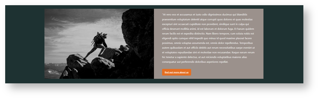
Example of Widget Use
Background colour, image, text and link/button positioning are set for each tile separately. This allows design flexibility for your content .
Where can the Widget be placed?
...
- All Page Templates
Widget Options
Left Side or Right Side next to a field refers to which content tile you are configuring.
| Option | Use | Comments | Available from Version | ||
|---|---|---|---|---|---|
| Description | A short description of the widget's use. | This description is added to the widget title. It makes the widget's use clear on the template page. | All | ||
| Layer | The layer the widget is valid for. | Use layering to limit widget content to certain groups of users. To use the same widget for more than one user group but with different options set, add the widget as many times as needed in the same zone. Then add layering to define the user group each time. | All | ||
| Background Colour | Select a colour to change for the background colour. The colour range available are thosehave been intetegrated from your style guide. | Default: default background colour integrated in your style guide | 4.37 | ||
| Hyperlink (Left Side) | Add a hyperlink for the left side ) | You can set the image to be left or right hand side and vice versa simply by selecting how you populate the content in the edit section. There is a (Left Side) content area and a (Right Side) content area: | Default is: ticked | 4.37 | |
| Tile Background Image (Left Side) | Upload an image for the left side tile. | 4.37 | |||
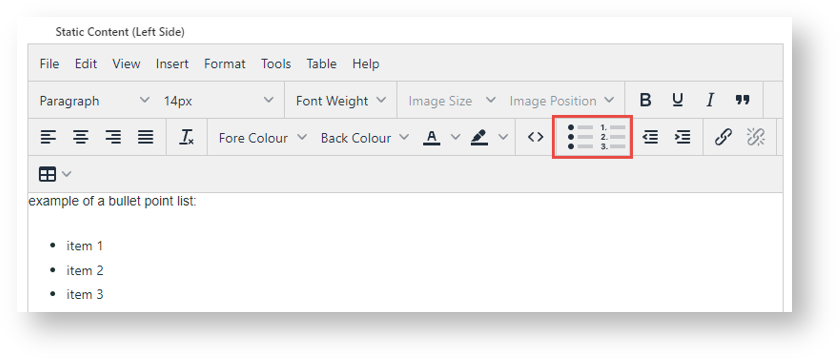
| Static Content (Left Side) | Use the textbox to add text to the left side tile. | Use the text editor to add styling or a button for the content. See below for some options. | 4.37 | ||
| Hyperlink (Right Side) | Add a hyperlink for the right side tile. | 4.37 | |||
| Tile Background Image (Left Right Side) | Pushes the widget to the right of the zone it is located in. | Tick to enable | Upload an image for the right side tile. | 4.37 | |
| Static Content (left sideRight Side) | You can set the content to be left aligned, center align or right aligned by using the native editor tools: |  Use the textbox to add text to the right side tile. | Use the text editor to add styling or a button for the content. See below for some options. | 4.37 |
Text Styling Options
Align text

Add bullet points and lists
Add buttons and call to action links
(Some HTML skills needed)
Switch to Source Code mode.

For a button, you can use this code:
<a class="btn primary" href="https://yourwebsite.com.au/">button text here</a>
- Edit button colour: change 'primary' to another colour from your style guide.
- Edit href: add the landing page for the link
- Button text: replace 'button text here' with a label for the button
Related
| Content by Label | ||||||||||||||||||||
|---|---|---|---|---|---|---|---|---|---|---|---|---|---|---|---|---|---|---|---|---|
|