...
| Excerpt |
|---|
Renders the top level product categories from a dropdown style button. The subcategories Subcategories are then displayed on the sidebar, changing as the user hovers over different categories in the listmenu. |
...
Example of Widget Use
...
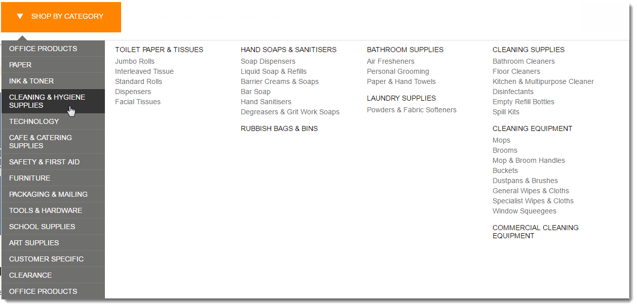
Where can the Widget be placed?
The widget can be used in the following templates:
- Theme Layout Template
...
Widget Options
| Option | Use | Comments | Available from Version |
|---|---|---|---|
| Description | A short description of the widget's use. | We recommended this field be updated so This description is added to the widget title. It makes the widget's purpose is clear at a glance from use clear on the template page. | All |
| Layer | The layer the widget is valid for. | The layering technology allows for the content to be shown to specific audiences. This is handy if the content is only valid for a certain type of user, or if the same widget is required Use layering to limit widget content to certain groups of users. To use the same widget for more than one audience, user group but different configuration is needed.The widget can be added to the zone more than once and the layer feature can determine which audience can see each widgetwith different options set, add the widget as many times as needed in the same zone. Then add layering to define the user group each time. | All |
| Button Label | The text Text displayed on the category dropdown. | Default is: SHOP BY CATEGORY | 3.88 |
| Product Category Menu List | Add each top level category that is not to be expanded by default. Use a comma to separate each category. Example: SX01,SX02,SX03 | The default is blank, which means all categories are expanded. |
...
4.31
| |||||||
| Maximum Number of Columns | Select the number of top level columns for the menu. | Maximum of four allowed. | 4.37 |
Related help
| Content by Label | ||||||||||||||||||||
|---|---|---|---|---|---|---|---|---|---|---|---|---|---|---|---|---|---|---|---|---|
|